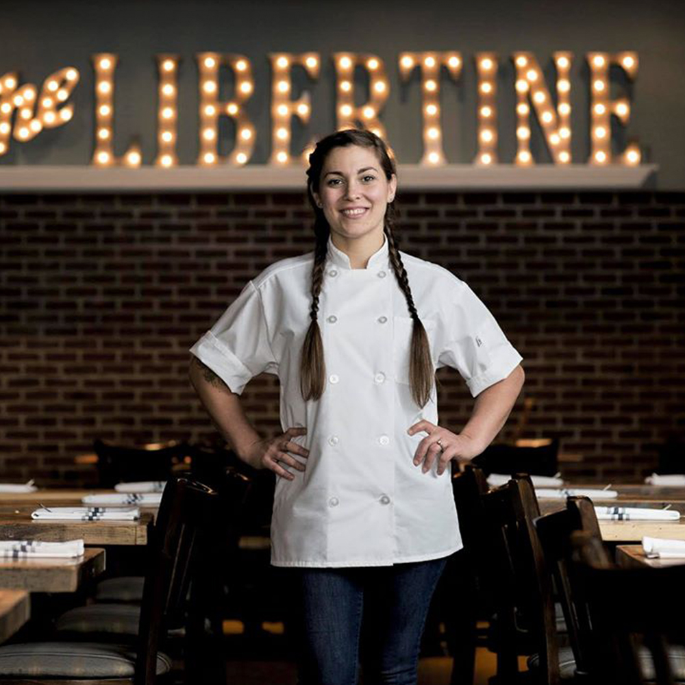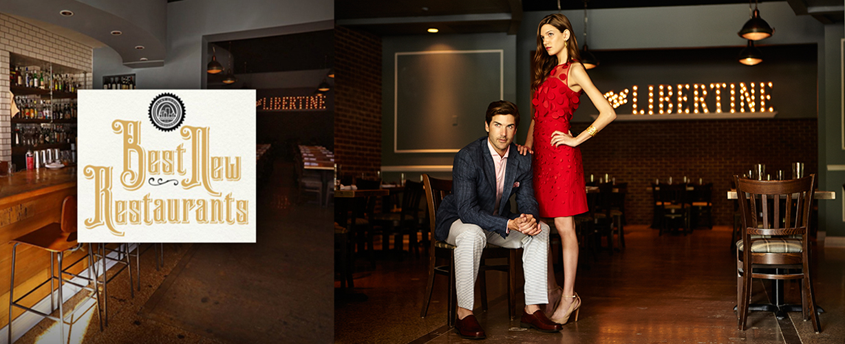
The Libertine
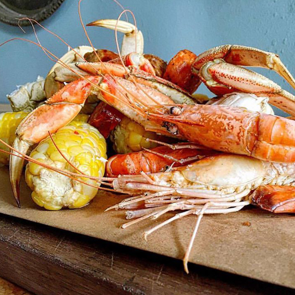
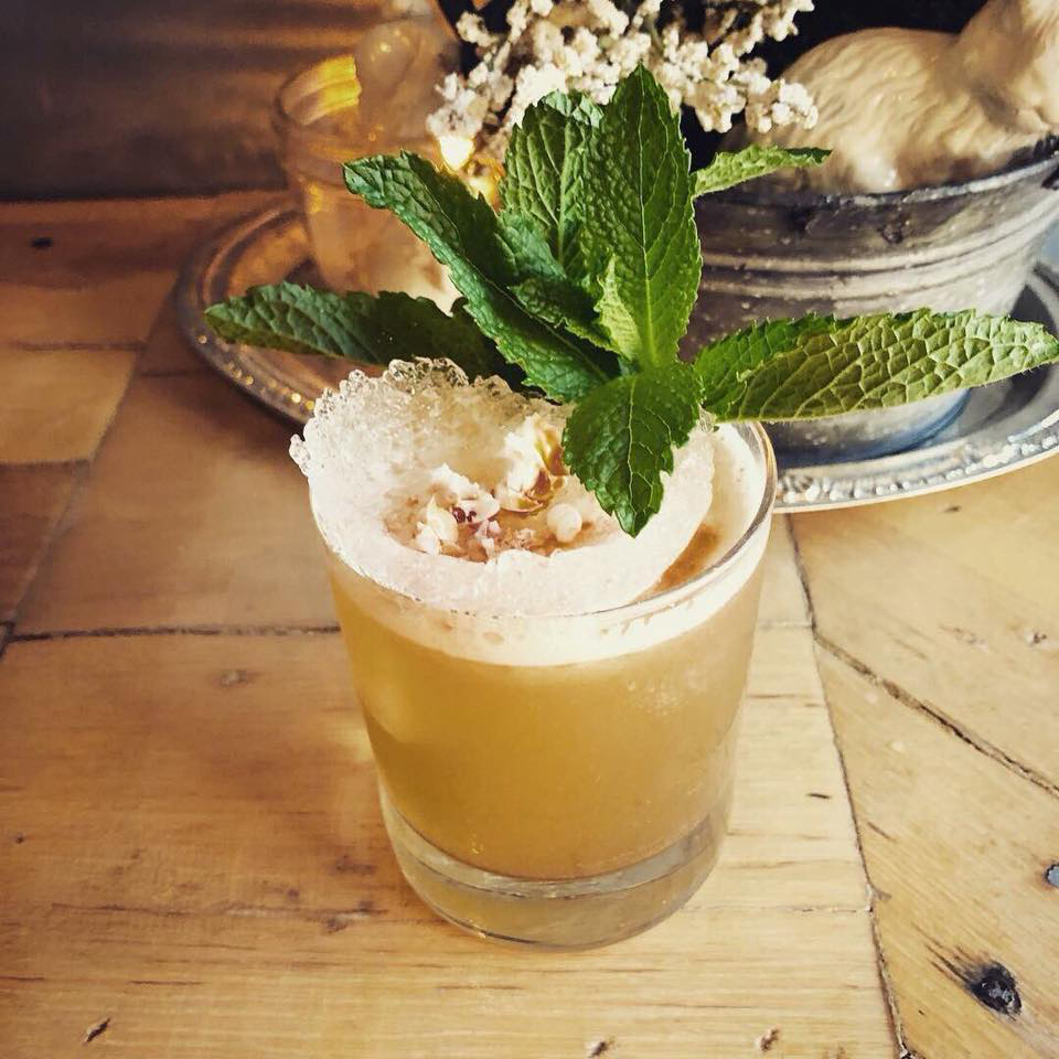
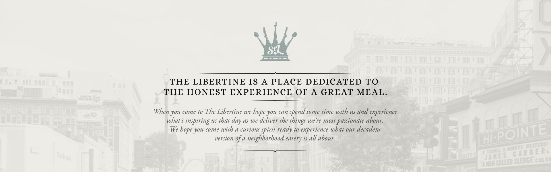
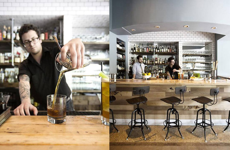
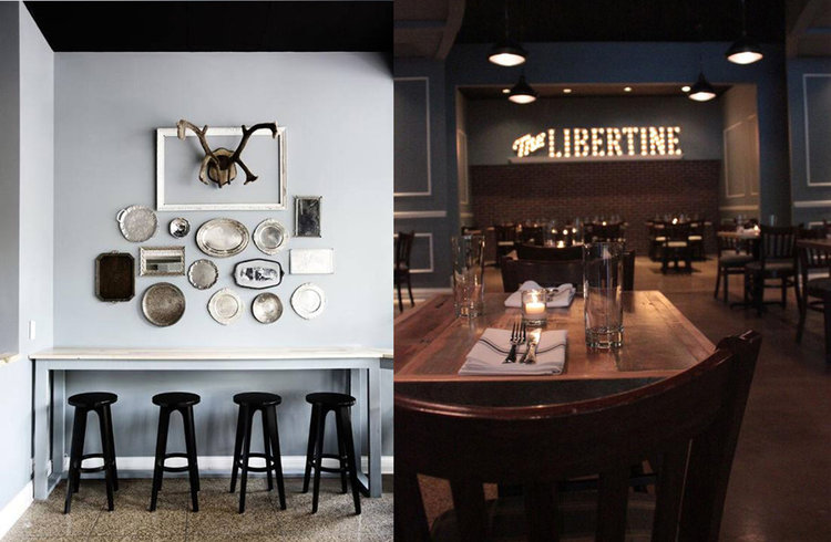
In essence, The Libertine exists as a union of all that one loves about their favorite watering hole: ease, warmth & simplicity; with a focus on the reasons one loves to eat in great restaurants – creativity, quality & flavor. Evoking a way of life centered on seasonality and the grand traditions of St. Louis life –The Libertine is a neighborhood gathering place for family, friends, and friends-to-be.
the challenge
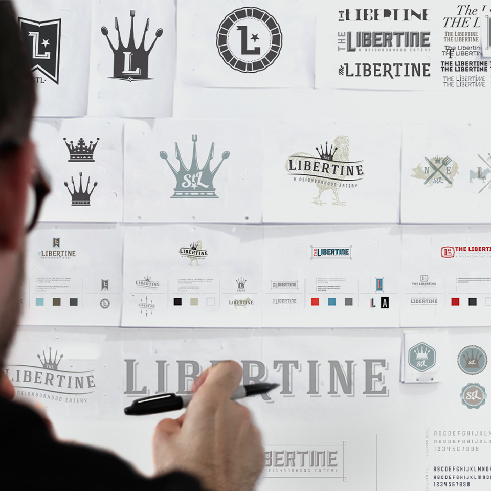
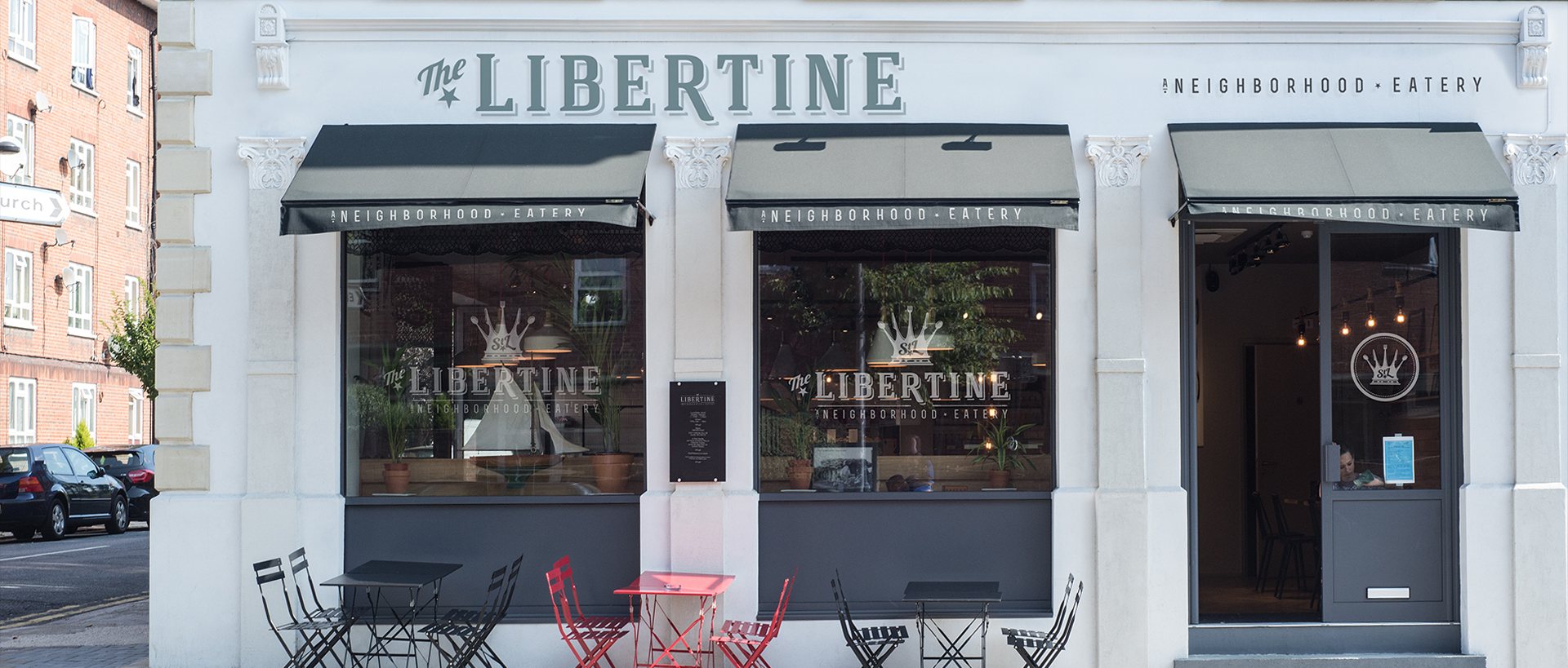
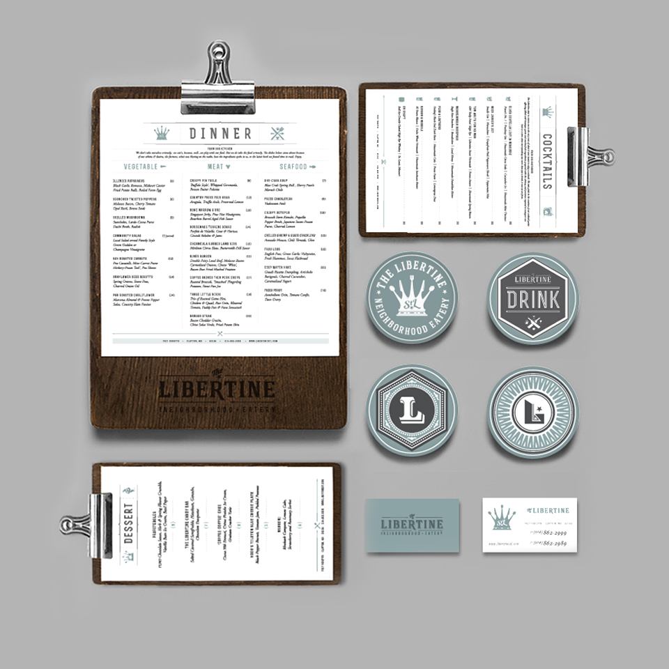
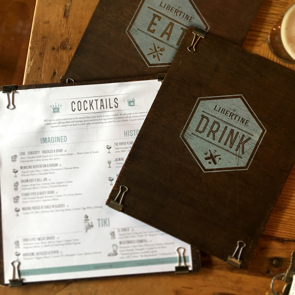
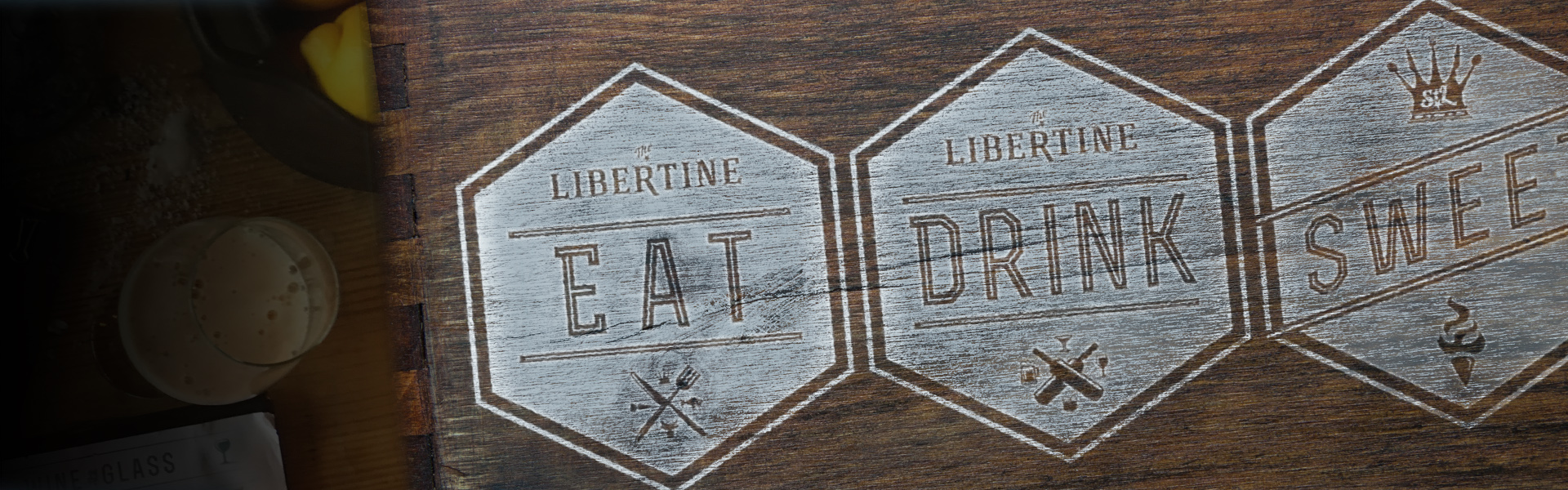
We were tasked to design the entire brand and visual identity of this new restaurant. We built the brand from the ground up. Every object that could be seen or touched was considered. Starting from logo to the hand-made menus to the website – even the interior design! We were able to develop a cohesive dining experience that was not only a feast for your tummy, but also a feast for your eyes.
The Service
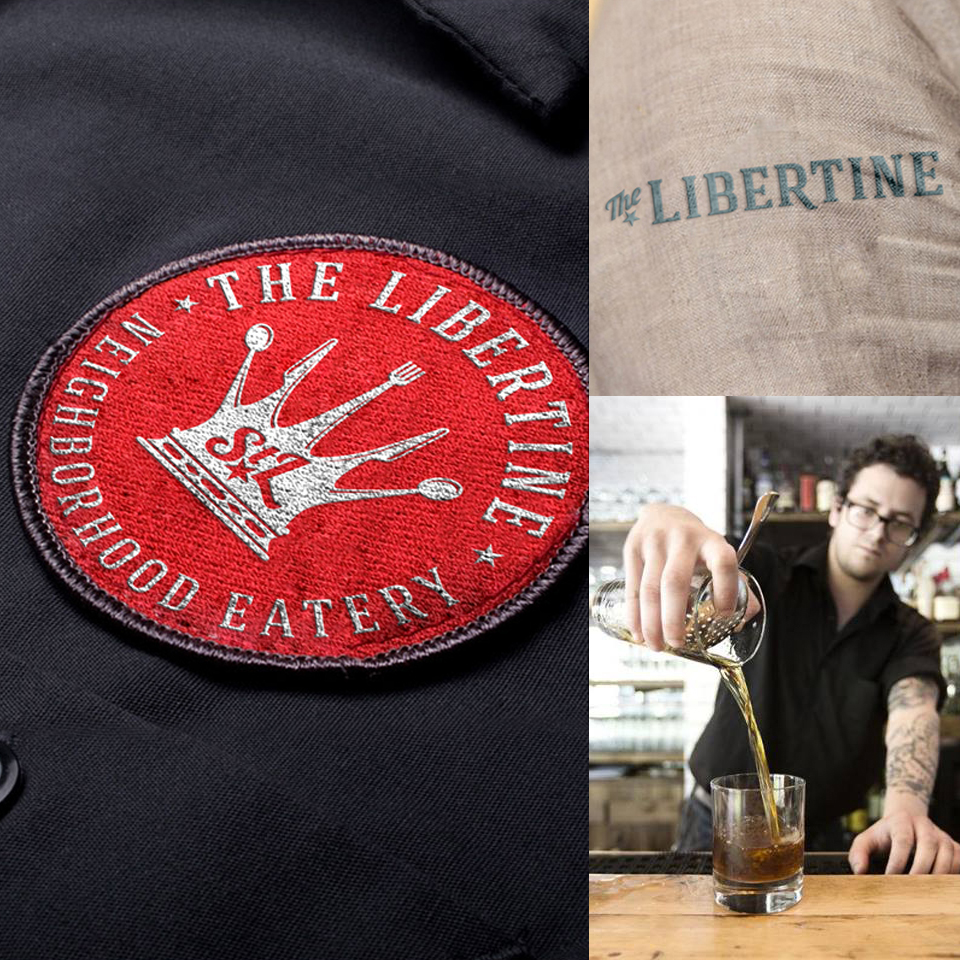
Brand & Identity
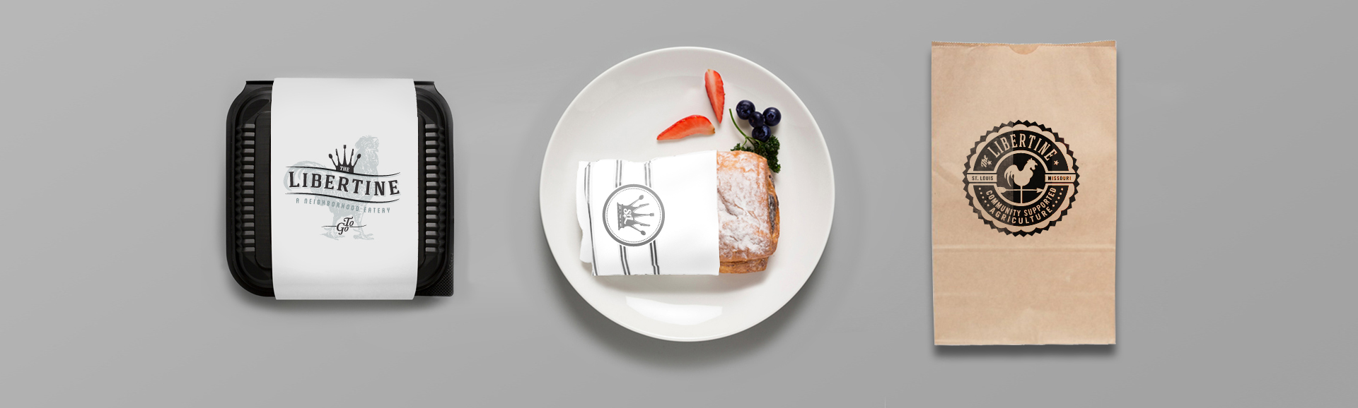
Print & Packaging
Website & Digital
Interior Branding
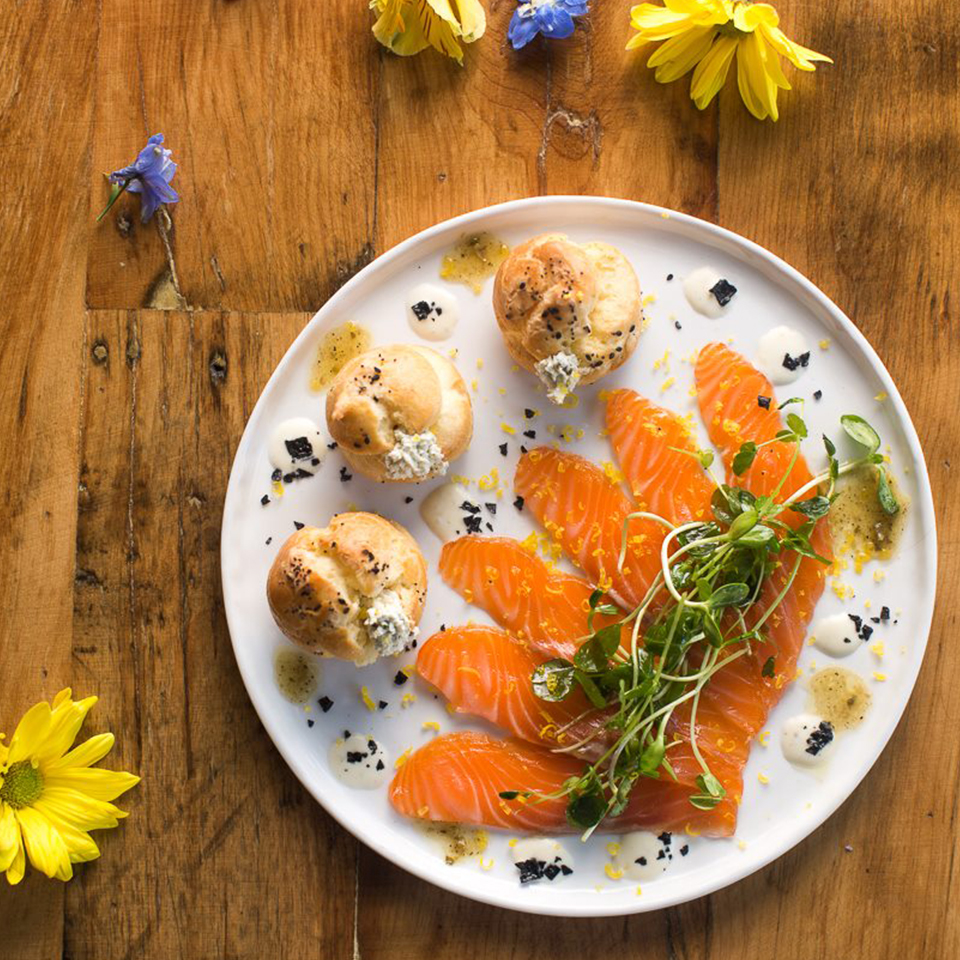
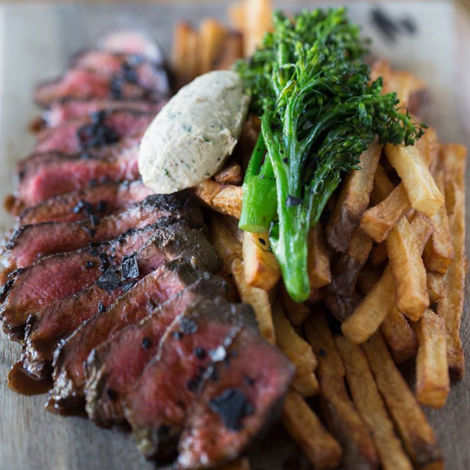
Photography
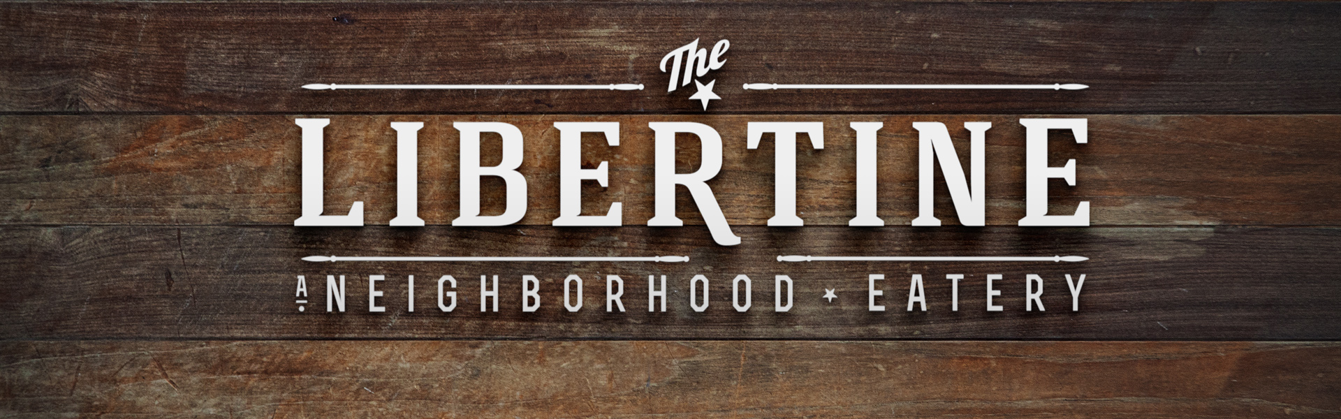
— The Branding & Identity —
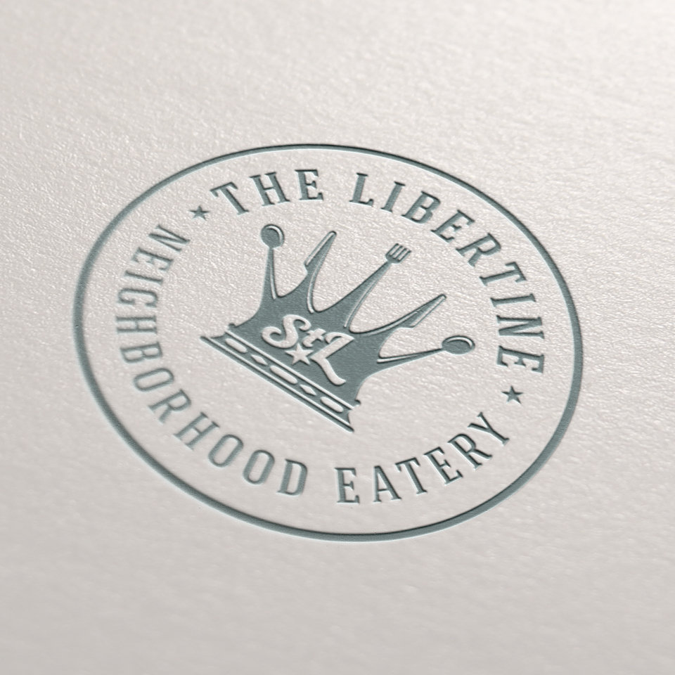
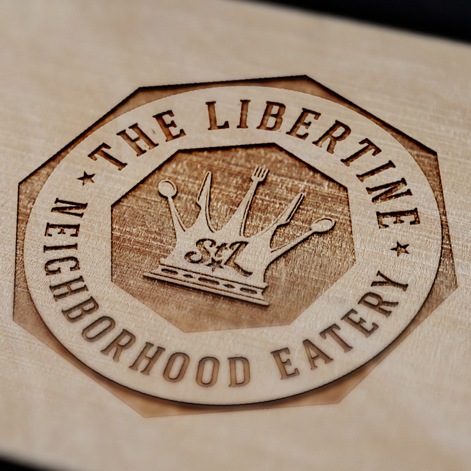
We wanted to create a fun a memorable brand identity. The concept of the crown seemed befitting because the owner, a successful restaurateur, deemed himself the “king of creative cuisines”. The final chosen concept just felt right and was indicative of how you felt when you were dining at The Libertine… Fun, Fresh, Memorable.
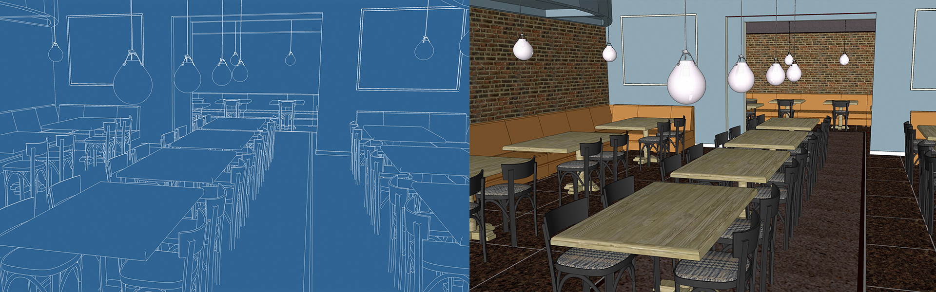
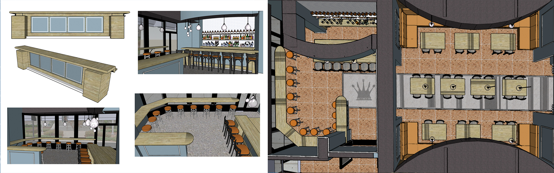
— The Interior Design —
We even tackled the interior design! Using 3-d software, we were able to plan out the interior structure and lay out the seating design and flow for maximum enjoyable dining experience.
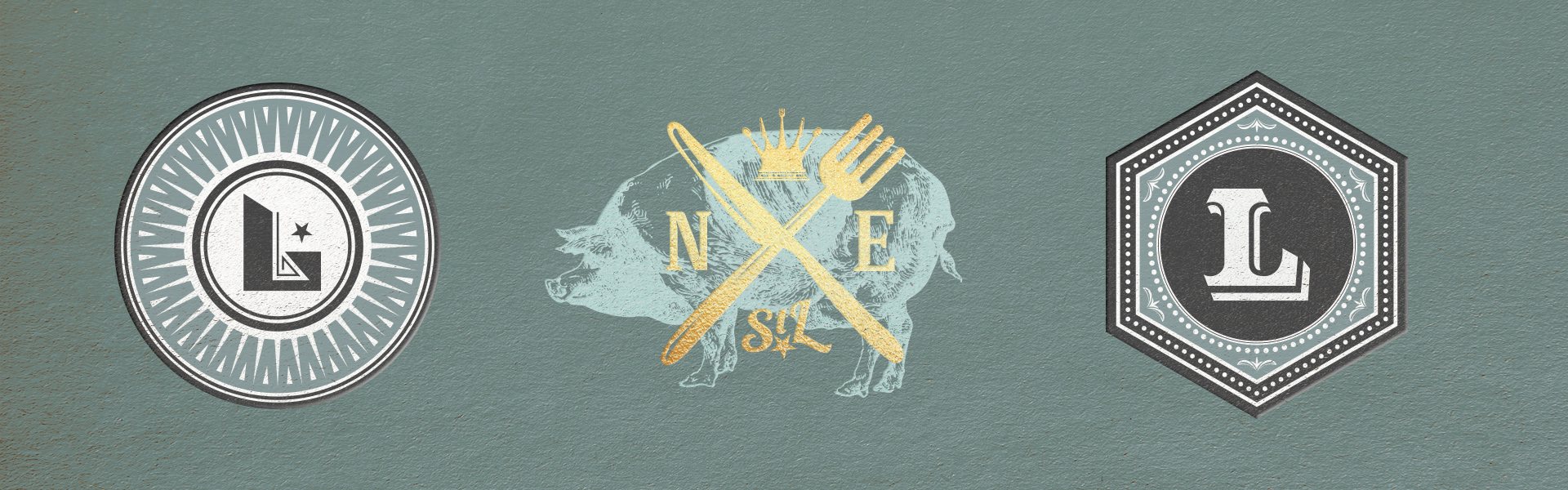
— the VISUAL LANGUAGE —
Once we established The Libertine’s logo and identity, we explored and crafted the visual language. Designing everything from the ground up, everything that could be seen was considered. We wanted to create a design language that felt cohesive and added to a memorable dining experience.
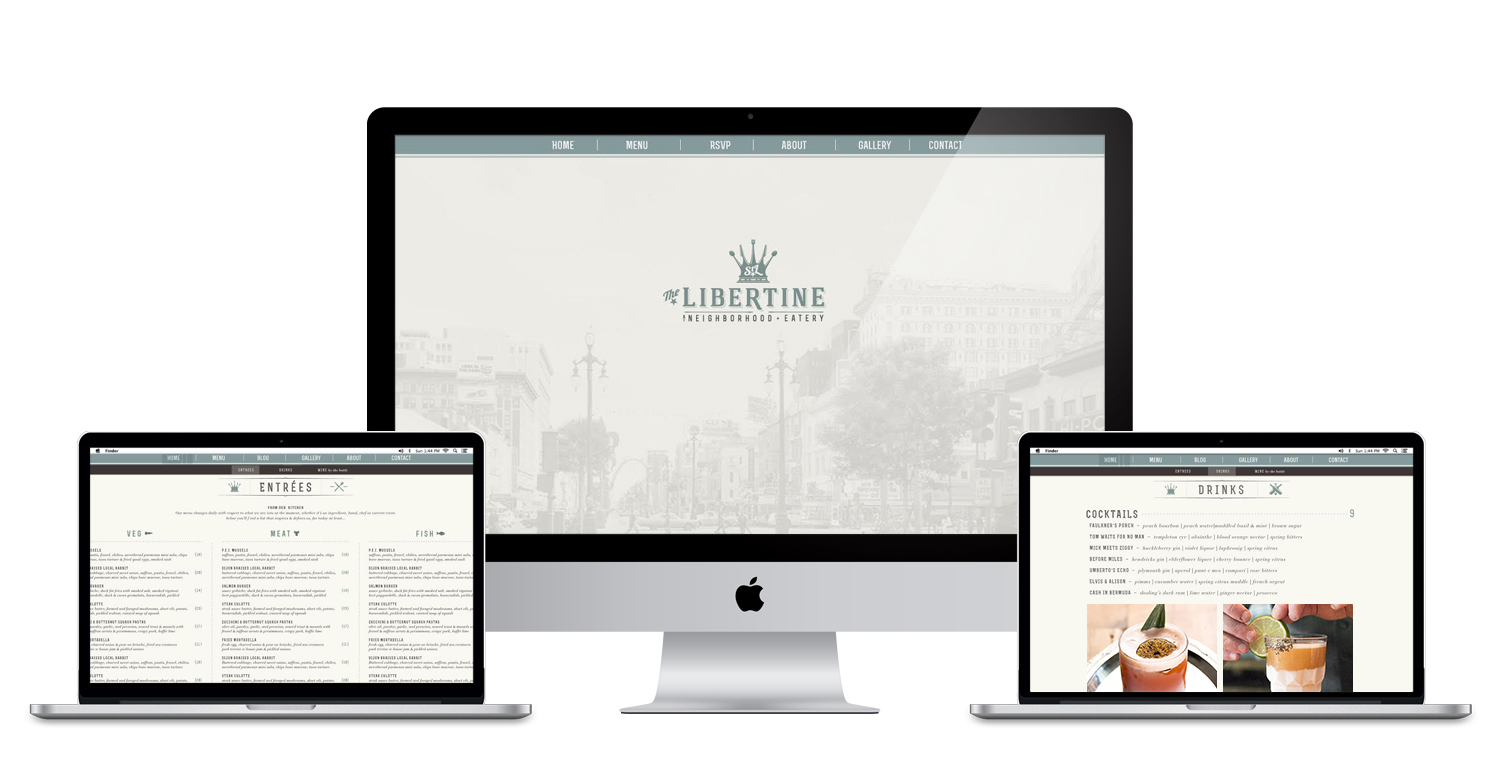
— The Website —
The website was designed to be a quick and easy access to the menu and to showcase all the extraordinary cuisines and drinks. Navigation and content was simplified for fast page loading and all fonts and colors kept cohesive with the rest of the established visual language.